“Help! I can’t browse the web! But I am connected to the Internet?! What gives?” You’re on WiFi. The...
Mission
I help people and organizations break free from outdated modes of thinking — by changing how they see, decide, and relate to themselves and others.
Pillars
I divide my work into 3 pillars.
Learn
I help people navigate the complexities of modern life by writing, lecturing, coaching, and consulting on topics that align with the principles laid out in my manifesto.
Apply
I believe in equality, the right to meaningful work, and economic justice and aim to level the playing field by offering tools of my own design.
Community
I organise community events for a diverse group of people, to foster relationship building and resilience among marginalised groups.
Community events
Coming soon.
MeetUp Group: Developers Without Barriers Rotterdam
I organise events in the city of Rotterdam. I focus on making tech more accessible to people who are neurodivergent, and everyone who's curious about tech but feels intimidated by the culture and the overwhelming nature of complexity.
Latest Posts
Your co-worker says, “The app needs to consume an API.” You nod. You don’t get it. You Google. It’s...
Imagine the digital world is made of LEGO. Programmers build and connect LEGO blocks (we call them...
Fantasy has created victims in the hundreds of millions. Porn isn’t just entertainment — it’s a...
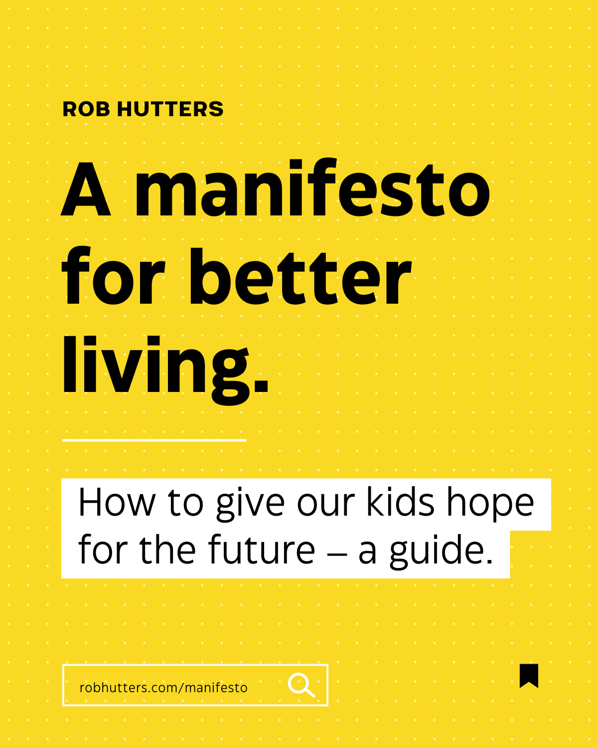
Read my manifesto
The 3 governing themes and corresponding examples.
Curiosity & Compassion
A unifying philosophy We cannot afford to extend respect or understanding to ideologies that harm people — We must reject any belief system that justifies violence, discrimination, or the suppression of love.
Meaningful work & Economic Justice
Right to meaningful WorkNo human being shall feel like their work doesn't meaningfully contribute to the greater whole. It's dehumanising to work a job that doesn't intrinsically motivate.
Sustainability & Community
A service-oriented economy To protect our future, we must reduce our reliance on finite resources. The way forward is a service-based economy — one that values human creativity, care, and connection over consumption.